branding
How to Choose Fonts that Will Elevate your Nonprofit’s Brand

Published by
The Nonprofit Template Shop
Posted on
August 8, 2022

We love the way fonts can impact the perception and personality of a brand – whether you’re trying to convey a casual, playful style or one that’s classic and elegant, or anything in between – they’ll help to set the tone and mood! However, as much as they can assist in elevating your brand, they can also do the opposite if used incorrectly. Thankfully, we’ve got some tips to help you choose fonts that work for your nonprofit’s brand (and work together)!
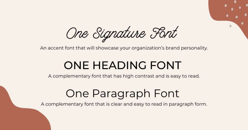
While there are no hard and fast rules to choosing brand typography, we believe that you don’t need to use more than three different fonts:
- One Signature Font: An accent font that will showcase your organization’s brand personality.
- One Heading Font: A complementary font that has high contrast and is easy to read.
- One Paragraph Font: A complementary font that is clear and easy to read in paragraph form.
When it comes to typography, we believe that less is more! Too many fonts can make a design look cluttered, messy, and unintentional. By choosing three fonts and sticking to them, you’ll have everything you need to create an eye-catching brand that feels professional and cohesive.
Ready to get started? Here are our tips for selecting the three fonts that you’ll need for your brand:
1. Start by defining your brand.
Great typography starts with a great brand! It’s important to be clear on how you want your organization to be visually represented before diving into font selection. What is the tone, image, or personality of your organization? How would you like visitors to feel when they interact with your brand? Can you narrow this down to one or two keywords? For example, do you want your organization’s brand to feel casual and approachable? Welcoming? Playful? Calm? Classic? Strong? Academic? Unconventional?
If you need some help with this step, start with our post How to Build a Cohesive Visual Brand Identity for your Nonprofit. Once you’re clear on the look and feel that you’re hoping to convey with your brand, you’re ready for the next step.
2. Choose a Signature font.
Your Signature font is the one that encompasses your brand’s personality, so it’s the best place to start! A Signature font is used in small doses–for example in a large headline, or as an accent font on a design–so it can be a little more fun, bold or unique. This font will be the one to visually convey the keywords that you chose in step 1.
To find your Signature font, start with some research using your “keyword + font.” For example, you can search for “Playful font” to see what comes up in the results. Try searching Google and Pinterest for ideas, as well as paid sites like Creative Market. You can also browse font websites such as Font Squirrel.
Once you have a few fonts that you feel capture the essence of your organization’s brand, it’s time to evaluate the font in the next step!
3. Evaluate your Signature font.
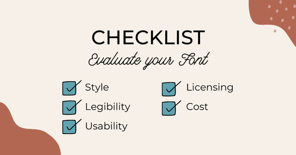
Before choosing your Signature font, it’s time to put it to the test. Here are the criteria you’ll want to consider:
- Legibility: Most importantly, how readable is your font? Because this is a Signature font, it won’t be used as the main font for large bodies of text, but it’s still important that it’s clear and easy to read.
- Usage: Think about how you’ll use this font and whether it will work in all of those situations.
- Licensing: Be sure to read the licensing agreement that comes with your font to avoid any legal issues (keeping in mind your intended usage).
- Cost: Finally, it’s important to consider the cost of licensing your font and whether that fits within your organization’s budget.
Once you have a font that you’re happy with and that checks all of the boxes above, you’re ready to move on to step 4!
4. Choose complementary Heading and Paragraph fonts.
The final step in choosing your organization’s brand fonts is to choose Heading and Paragraph fonts that will work well with your Signature font. Here are a few tips that we use when selecting great complementary fonts:
- Use classic fonts: Stick to the basics with Heading and Paragraph fonts. Your goal here is to support the brand with clean and clear typography. We suggest using two sans serif fonts or one serif and one sans serif. Two serif fonts can sometimes look too visually cluttered.
- Complementary style: If you chose a very ornate or bold Signature font, be sure to choose a more minimal Heading and Paragraph font so that they aren’t competing with each other for attention. Do some testing in this stage if possible to get a visual picture of how your fonts will work together.
- Legibility: This is even more important when it comes to Heading and Paragraph fonts because you will have a lot of text using these fonts. Be sure to evaluate your font by applying it to several paragraphs of text to make sure it’s easy to read.
- Usage, licensing + cost: The same criteria that we discussed in Step 3 applies here as well. Double-check the licensing and cost of each font to ensure that it works for your organization’s needs.
- Bonus tip: It can also be helpful to see if your chosen fonts are available in the software or programs that you use (for example, Canva, Google Docs, etc.). While this is not necessary (you can upload your own fonts to Canva, for example) it can make life that little bit easier. So if you’re torn between two fonts and one is available in all of your software programs, that can be a deciding factor.
5. Add your fonts to your brand guide.
One final step after choosing your fonts is to add them to your organization’s brand guide and implement your new typography into everything you design or create! Share your new fonts throughout your organization so that everyone is on the same page and your organization’s brand is consistent.
As we shared in the introduction, when it comes to typography, if you’re not sure what to choose, simple is usually better! While choosing only three fonts might not seem like a lot, don’t forget that within your selection of fonts, you can use variations of each for more flexibility. For example, most fonts come in various weights, such as semibold or bold, as well as in an italic version. You can get even more flexibility by manipulating the spacing between letters (tracking) or using uppercase. You’ll find this gives you more than enough flexibility to create any designs that you might need!
Related Posts